Gotham vs. TheSans
Typography Comparrison Project
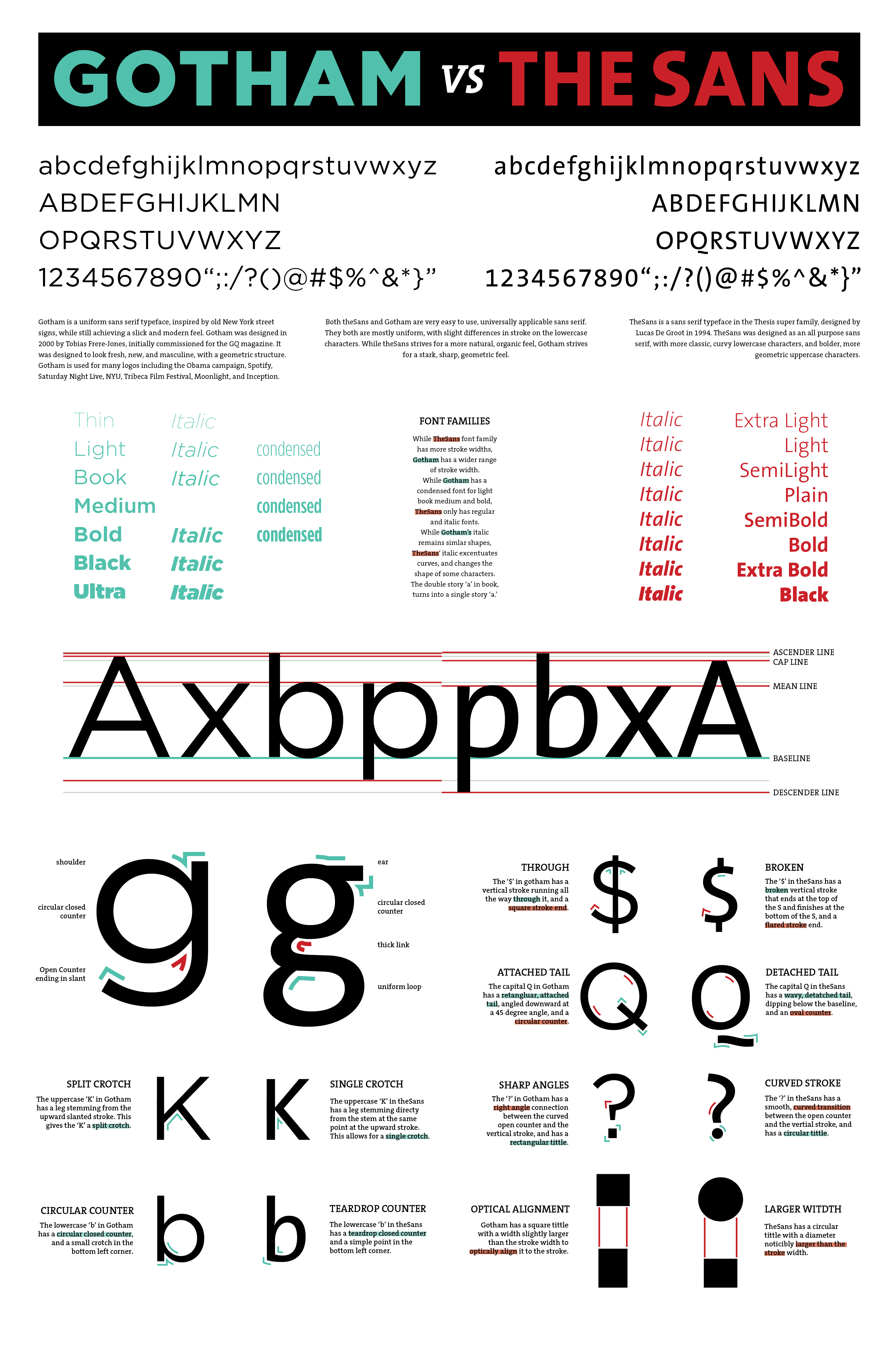
This in-depth typography comparison displays the intricate differences of two typefaces: "Gotham" and "TheSans". In addition to a side-by-side comparison, it also highlights what I find are the key differences between these two typefaces. As a result of looking so closely at these details, I gained a better eye for evaluating the pros and cons of selecting a particular typeface for a project.